


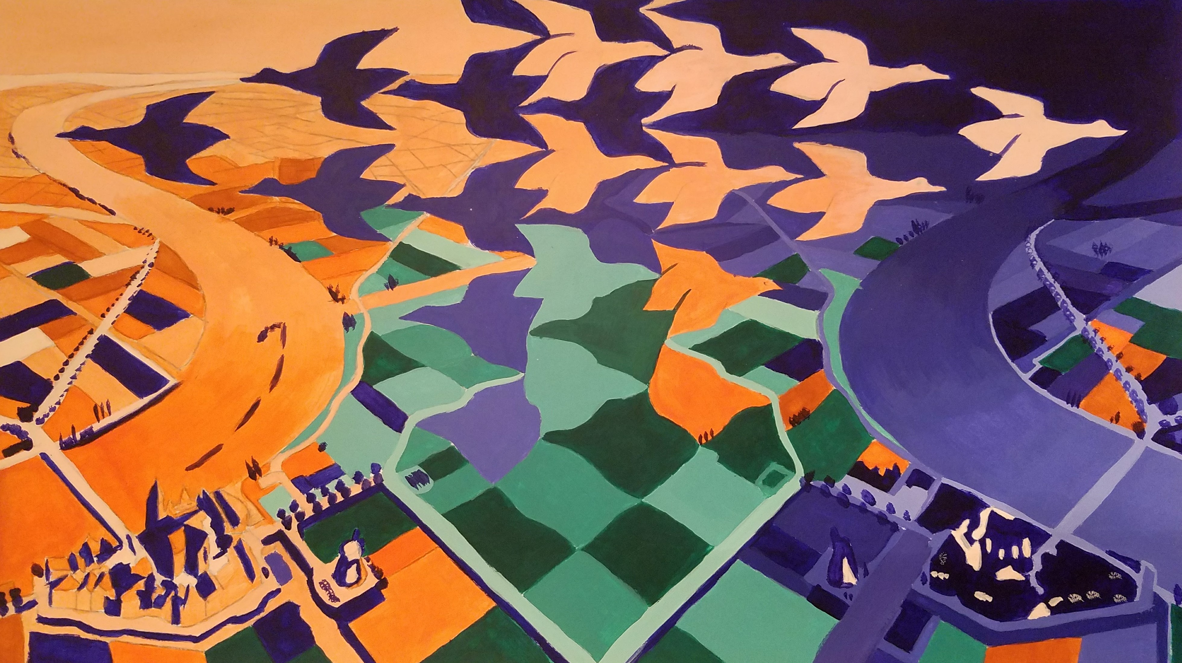
M.C. Escher Color Study
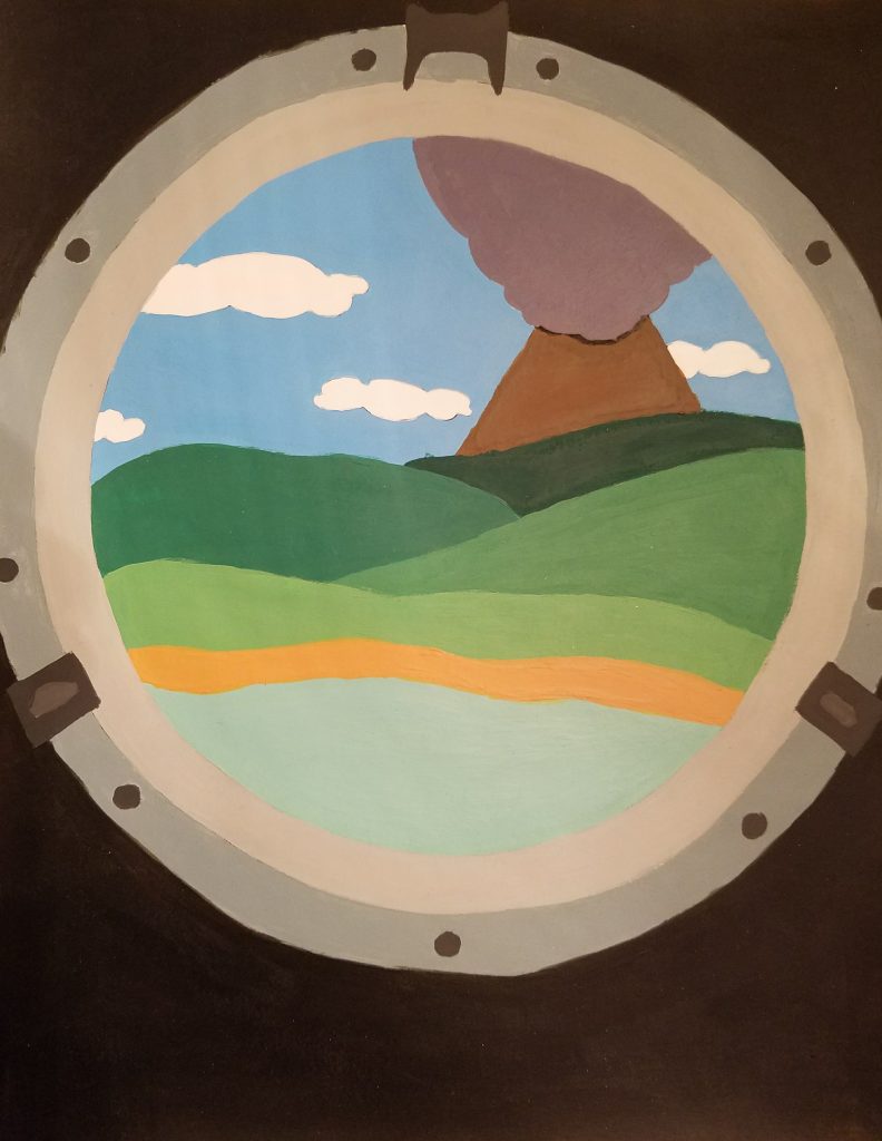
Our last project for Fundamentals of Design was to choose one of three black and white works by M.C. Escher to help understand triadic colors. We were allowed to choose whatever triadic colors we wanted.
My brother and I have been huge Escher fans since we were children and have a few books focused on his art. This piece was always one of my favorites and I figured if anyone would appreciate it after I was done, it would be my brother, so I made this with him in mind.
Honestly, I picked the kind of salmon/orange color because salmon is one of my favorite colors and, over the years, has become one of my signature colors both in the clothes I wear and design work made for my personal brand. As it matched up with the blue shade, which I knew my brother would like, and the green did well for the fields, I felt this was the perfect color combination.
We had to mix our own paint colors so I was very careful with how I blended from light to dark and the reverse to not overload everything. Escher's original piece has way more details than I was able to achieve as we had to trace over it and I could only do that so well. Though one of the hardest decisions was trying to figure out when to stop painting the salmon and indigo color as the birds faded into the fields.
Overall, I'm really happy with how this came out and my brother really liked it as well. My professor was a big fan of it and I showed it to my Drawing I professor the next semester, he also had good things to say about it and thought it looked very nice.