


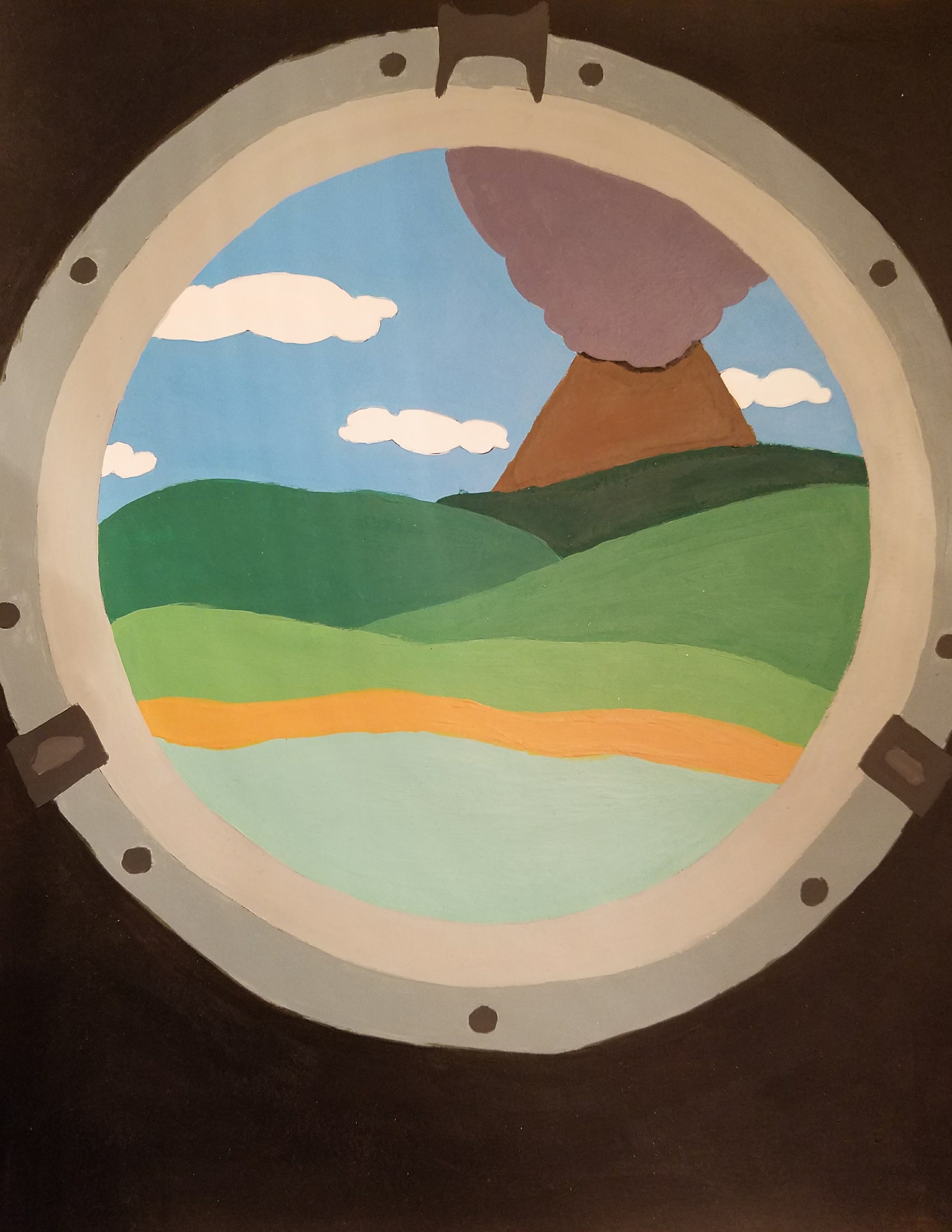
Color Study
This was a Fundamentals of Design project to use acrylic paint on bristol board to paint something in color and then try to recreate it in greyscale.
We were allowed to paint anything we wanted but we had to imagine it from a different point of view than we normally would. I imagined a volcanic island and then decided it would be seen through the porthole of a ship. It's kind of childish-looking, but we weren't supposed to blend too much as we wanted the edges of colors to stand out in a way.
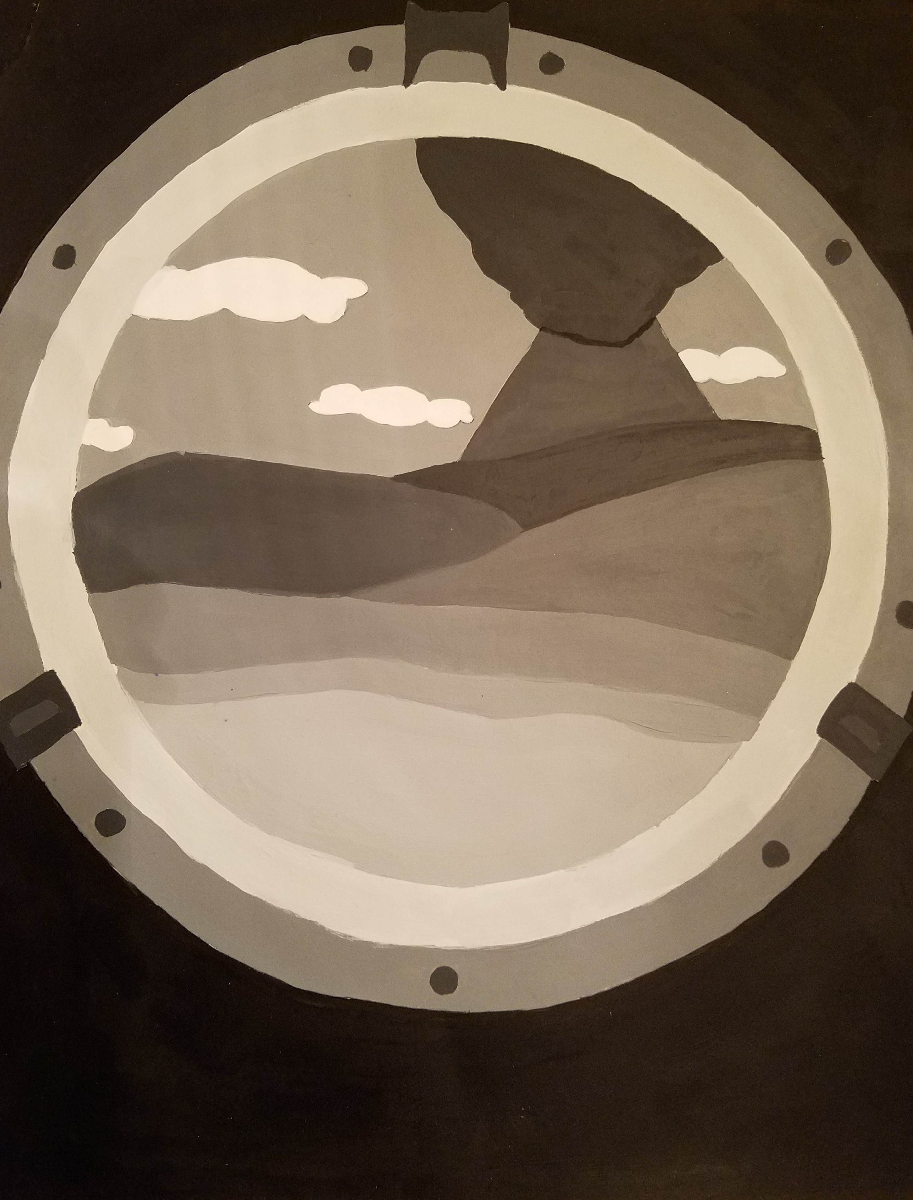
Greyscale
This is the greyscale version I came up with of the color piece on the left.
While most people in class painted each different color as a different shade of grey, I noticed, after years of having to print out color photos as greyscale at work, that plenty of colors will look the same in grey. So I took a photo of my color artwork with my phone and put it through a few greyscale filters to see which one looked best and then shared certain levels of grey between colors.